
US labour productivity grew about 2.2% in 2025, down from roughly 3% the year before, according to the Bureau of Labor Statistics. For a mid-market company that spent the stronger years hiring to keep pace with demand, a slowdown like that lands as a specific problem rather than a headline: the growth that used to arrive with the tide now has to be found inside the operation. An operational efficiency assessment, sometimes called an enterprise efficiency assessment, is how you go looking for it, and whether it finds anything depends almost entirely on what it chooses to measure.
What an operational efficiency assessment actually is
The phrase gets used loosely. It covers everything from a consultant’s utilisation study to a genuine, costed map of where a company’s work leaks time and money. Most of what carries the label produces a document that confirms what everyone already suspected and changes nothing, because it measures activity instead of cost.
The textbook version of the metric is simple enough: operating expenses divided by revenue, expressed as a ratio. That ratio is worth knowing as a headline, but on its own it only says the operation is heavy and stops there, with no indication of which part of it to fix. A real assessment has to get underneath that number and find the specific work that is generating the cost.
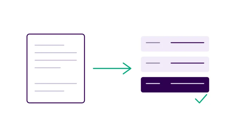
A useful operational efficiency assessment does something narrower and harder. It takes the company’s core processes, breaks them into the actual activities people perform, and works out how much each activity costs to run and how much of that cost is recoverable. The output is not a grade or a maturity score. It is a ranked list of where the money goes and which of it you could get back.
That distinction matters because most scaling companies do not have an efficiency problem they can see. They have one they can feel. Revenue is up and the team has doubled, but margin has not moved the way the growth suggested it should. Somewhere in the operation, effort is being spent that does not show up as output, and the job of the assessment is to locate that effort precisely enough to put a number on it. When a company has scaled by adding people to keep processes moving rather than by building systems that move them, it has hit what we call the Manual Wall, and an assessment that is worth running is the thing that measures how tall the wall has grown.
Why the timing has changed
For most of the last decade, a growing services company could treat operational drag as a cost of doing business and let a strong market cover it. That cover is thinning. With productivity growth decelerating across the economy, the margin a company used to get from favourable conditions increasingly has to come from its own processes instead.
At the same time, the amount of work that is technically automatable has climbed. McKinsey’s 2025 research estimated that currently demonstrated technologies could automate activities accounting for around 57% of US work hours, with most of that concentrated in digital, rules-based tasks. That figure is a statement of technical potential rather than a forecast of job losses, and it should be read carefully, but the direction is unambiguous: a large share of what people do at their desks is now the kind of work software can take on. An assessment that does not go looking for that share is leaving the most recoverable cost in the building unmeasured. This is the gap a real assessment is built to close, and it is why the exercise is worth more now than it was three years ago.
Left unmeasured, that recoverable cost does not stay still. Every new hire trained into a manual process makes it more expensive to change later, because the workaround becomes institutional knowledge that the next person learns as though it were the job itself. A company that postpones the assessment quietly raises the cost of the fix it will eventually have to make, since the manual workarounds keep accreting while it waits. That compounding is the real price of treating operational drag as background noise, and it pushes the cost base toward more headcount rather than less.
What should an operational efficiency assessment measure?
Here is where most assessments go wrong. They measure utilisation, headcount ratios, and how busy people are, because those numbers are easy to collect and they feel like efficiency. The number that actually changes a decision is a different one: how much cost is trapped in work that does not need a human doing it, and how much of that cost is recoverable this year.
The reason this matters is that busy and wasteful look identical on a utilisation chart. A team can be fully occupied and still spend most of its hours on work that adds nothing a customer would pay for. Asana’s Anatomy of Work Index, a survey run by the work-management vendor, has repeatedly found that knowledge workers spend around 60% of their time on coordination and duplicated effort rather than the skilled work they were hired for. A separate survey from Smartsheet, another software vendor, reported that more than 40% of workers spend at least a quarter of their week on manual, repetitive tasks like data collection and entry. Treat vendor surveys as directional rather than gospel, but the pattern they point at is real and it is visible in almost every operation once you look: a large slice of paid hours goes to moving information around by hand.
So the assessment measures activities, not roles. It asks, for each core process, what steps a person actually performs, how long each takes, how often it runs, and whether the step needs human judgment or is simply a person who bridges the gap between systems that do not talk to each other. That last category, the Human API problem, is usually where the recoverable cost concentrates, and it is invisible to any assessment that stops at the level of the org chart.
This is also what separates an efficiency assessment from a cost-cutting exercise. Cost-cutting asks what the company can stop doing or buy more cheaply, and it usually lands on headcount because payroll is the visible number. A recoverable-cost view asks which of the hours the company already pays for are going to work a system could do, so the same people can be pointed at work that only people can do. The first approach shrinks the operation, while the second raises what it can carry at the same cost, which is the version that survives contact with a growth plan.
How to run an operational efficiency assessment, step by step
Start by picking the processes that carry the most volume, because that is where a small per-unit saving compounds into a real number. Order intake, billing, claims or case handling, reporting, onboarding: whatever your company does many times a day is where to point the assessment first.
For each of those processes, map the actual steps as they happen, not as the process documentation claims they happen. The gap between the two is often the finding. Sit with the people doing the work and count how many systems they touch to complete one unit, and how much of their time goes to re-keying data that already exists somewhere else.
Then attach a cost to each step. Time per unit multiplied by volume multiplied by loaded labour cost gives you a defensible number for what that step costs the business each year. Do this honestly and the picture usually reorders itself: the step everyone complains about turns out to be cheap, and a quiet bit of daily re-keying nobody mentions turns out to cost more than a full salary. Putting a figure on that hidden work is exactly what our Manual Wall Calculator is built to help a team do for a single process before committing to a full assessment.
Finally, sort the findings by recoverable cost and by how hard each one is to fix. A step that costs the business a large amount every year and could be automated with a well-understood tool goes to the top. A step that is expensive but genuinely requires human judgment stays where it is. The sort is the deliverable, because it turns a list of complaints into an ordered plan.
What a good assessment actually produces
The output of a real operational efficiency assessment is a ranked, costed bleeding report: every significant process-level leak, with a pound or dollar figure attached, ordered so the highest-return fix sits at the top. A finance leader should be able to read it in one sitting and know both what the operation is losing and what the first three months of fixing it would return.
To make that concrete, picture a typical finding, described as a pattern rather than a specific company. A services business runs its monthly billing through a team that exports data from one system and reshapes it by hand in a spreadsheet. They then re-key the result into the platform that issues the invoices, a step nobody records because it was never written down as anyone’s job and has simply become how billing gets done. An assessment that counts activities catches that step and prices it, once the hours are totalled across the year, at more than a full salary, with a well-understood integration usually available to remove most of it. In our experience these quiet between-systems steps, rather than the loud bottlenecks everyone already argues about, are where the largest recoverable cost tends to sit.
That ordering discipline is what we call ROI-ordered sequencing, and it is the difference between an assessment that gets acted on and one that gets filed. When every finding carries a number and the numbers are ranked, the argument about what to do first stops being a matter of opinion. The three P&L numbers that reveal the Manual Wall give a leadership team a fast way to sanity-check the top of that list against the accounts they already have.
An assessment that ends in a maturity score, a colour-coded grid, or a general recommendation to “improve process discipline” has not done the job. Those outputs describe the problem in a way that cannot be argued with and cannot be acted on either, which is the worst of both.
Can you run an operational efficiency assessment yourself?
Often, yes, at least for a first pass. The method above is not secret, and a capable operations leader who is willing to sit with the work and count honestly can produce a useful first map. The limiting factor is rarely analytical sophistication. It is the honesty of the measurement, because the hardest number to get is the true time cost of work that everyone has stopped noticing they do.
Two things tend to defeat the internal version. The first is that people close to a process cannot easily see the steps that only exist to compensate for a broken system, since those steps have become simply how the job is done. The second is that an internal assessment competes with everyone’s day job and quietly stalls. That is the point at which bringing in an outside operator earns its place, and it is what we built our Profit Leak Diagnostic to do at Digital Forms: a four-week, fixed-scope assessment that produces the ranked, CFO-ready bleeding report and hands back a plan the team can act on. Whether you run it yourself or bring someone in, the test of the assessment is the same, which is whether it ends with costed, ranked findings or with a document that describes the weather.
Where this leaves you
If your company is scaling and the margin is not keeping up, the odds are good that an operational efficiency assessment would find real money, and the odds are also good that the version most vendors would sell you would miss it by measuring the wrong things. Insist on the version that counts activities and ranks what is recoverable by cost. Once you have that list, the first fix is usually small enough to ship inside a few weeks, which is what an Operations Sprint is for, and the result of that first fix is what funds the appetite for the next one.
The productivity tailwind is not coming back soon. What would it change if you knew, to the pound, where your own operation was leaking?